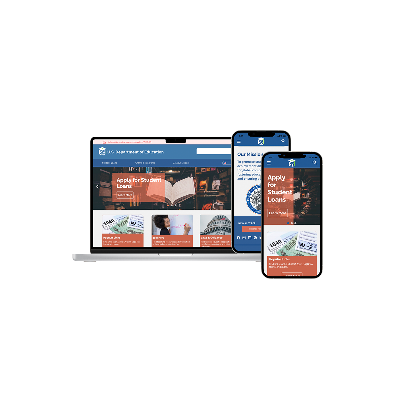
Responsive Web Design · Archived
Department of Education
01
Overview
Over 90% of users visiting the Department of Education website had one goal: find out how to repay their loans.
The existing site buried that information under layers of navigation, broken links, and unexplained acronyms. We set out to redesign it — responsive across all devices, accessible to WCAG AA standards, and built around what users actually came to do.
02
Research
We conducted proto-persona development, user flow mapping, heuristic evaluation, accessibility auditing, and one-on-one usability interviews with six participants. Key pain points surfaced quickly:
- Navigation between supporting sites was confusing and poorly labeled
- FAFSA links were broken
- Acronyms were used throughout with no explanation
- The site wasn't usable on mobile
The clearest research finding: simplify the path to loan repayment information. Everything else was secondary.
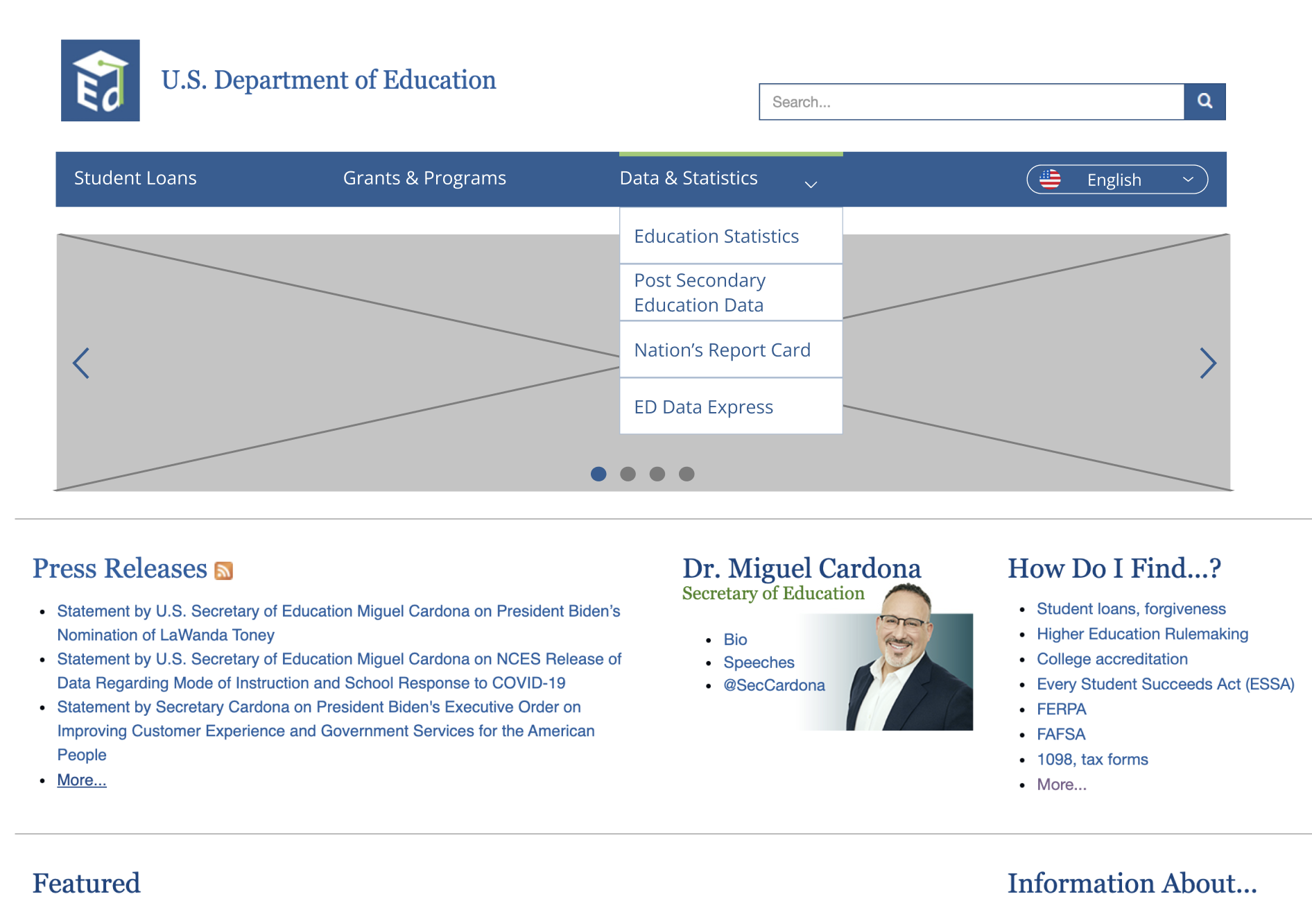
Original site — information overload, buried navigation
03
Design process
We redlined and annotated the existing navigation structure, then ran card sorting sessions to rebuild the information architecture from the ground up. From there we moved to wireframes across mobile and desktop, built clickable prototypes, and tested across ten participants using 5-second testing on all three breakpoints.
My focus areas: color palette, card component design, navigation systems, and mobile responsiveness. We held off on visual polish until the structure was validated — a lesson learned from prior projects.
04
Outcome
The redesign simplified the information architecture, surfaced loan repayment pathways prominently, fixed broken navigation, and achieved WCAG AA accessibility compliance across desktop, tablet, and mobile.
Start with what users actually came to do.
Also archived